Contact
Improving Skyscanner's Data Transparency
PROJECT OVERVIEW.
My Role
UX Research
Usability Testing
UI Design
Teammate
Individual
Timeline
3 weeks
Tools
Figma
Description
A feature designed to empower Skyscanner users with clear control over their data through simplified settings and interactive tutorials.
Context
What if you could clearly see who has access to your data and how it’s being used? Many digital services hide these details, leaving users unsure about their data’s safety.
This feature for Skyscanner makes data usage simple to understand, putting control back in the hands of the users and building trust through transparency.
PROBLEM.
What was the goal? 🤔
Skyscanner currently presents three separate data policies: Cookie Policy, Privacy Policy, and Terms of Service. However, it requires users to visit an external website to access detailed information. Although the app initially highlights the importance of the cookie policy through pop-up notifications, users are left without sufficient in-app details. This lack of transparency creates a disconnect, making it difficult for users to fully understand and control their data, which can diminish trust in the platform.
How might we... create an engaging, transparent experience that enables Skyscanner users to make informed choices about their data usage?
SOLUTION.
Making fun but effective changes 🪄
I simplified the existing cookie policy pop-up and added an optional tutorial to help users learn more about cookies directly within the app. The tutorial simplifies the lengthy information that was only available on our external website, turning it into key points with icons for quick recognition and a friendly tone to make it more approachable. This approach encourages users to easily understand and take control of their cookie preferences without feeling overwhelmed by excessive details.

PROJECT PROCESS.
Visualizing the Design Process ✍️
I followed the Double Diamond design thinking process for this project to explore the problem deeply and develop a focused, user-centered solution.
1
DISCOVER 🔎
User research
Screen flow (Research I)
User flow (Research II)
2
DEFINE 📌
Analyzing findings
User persona
Visual research
“How Might We” statement
3
DEVELOP 💬
Low/Mid-fidelity wireframe
Usability testing
Ideation
High-fidelity wireframe
4
DELIVER 📦
Final design
Reflection
DISCOVER.
User research 👥
I conducted user research on the current Skyscanner app to identify its target audience and determine key considerations for the redesign. This research focused on understanding user demographics, preferences, and behaviours to ensure the new design would address their needs effectively.
GENDER
Male
46.73%
Female
53.27%
Skyscanner's audience is 46.73% male and 53.27% female.
AGES
The largest age group of visitors are 25 - 34 years old.
Skyscanner is an app used by a broad group of people.
CHARACTERISTIC
50%
Skyscanner saw a 50% rise in mobile bookings in early 2022, reflecting travellers’ growing preference for booking trips with the same ease as other mobile purchases.
Screen flow 📲
Before conducting detailed user flow research, I created a screen flow to visualize how Skyscanner presents its data policies across screens. This helped me get an overall picture of the app’s current approach to data transparency.

KEY INSIGHTS
Skyscanner’s data policies are only detailed on an external site, and users can control only the Cookie Policy—not the Privacy Policy or Terms of Service.
The app shows a pop-up about data control once, at first launch, emphasizing the Cookie Policy specifically.
This focus on the Cookie Policy led me to prioritize improving transparency and control for this area within the app.
User flow 🗺️
After mapping out the current user flow, I identified some potential improvements for future updates. While users can control their cookies in-app, they lack access to detailed explanations about each cookie type. This lack of clarity makes Skyscanner's cookie experience less user-friendly and leaves users uncertain about the benefits and functions of different cookie types.

DEFINE.
Analyzing findings 📊
During the ‘Discover’ phase, I identified areas for improvement to enhance user experience in controlling their data. Although Skyscanner highlights its cookie policy with the slogan ‘Your data, your choice,’ there are clear areas in need of refinement.


POP-UP SCREEN
Limited accessibility: Only appears once during the first app use.
Inconvenient access: Users must visit an external website to view the full cookie policy.
Dark UX design: Encourages users to accept all cookies without adequate explanation.

DATA SETTING PAGE
Abstract descriptions: Each cookie type is described too vaguely, making it hard for users to understand their purpose.
Lacks visual aids: Absence of visuals makes it less user-friendly and harder to follow.
Inconvenient access: Users must visit an external website to view the full cookie policy.

EXTERNAL COOKIE POLICY WEBSITE
Lengthy and complex language: The text is long and filled with complex terms, making it challenging for users to grasp the information.
Unrelated visuals: Some icons are included, but they lack relevance to the content, providing little support in clarifying details.
Limited comparability: The structure makes it difficult for users to quickly compare and understand the different cookie types and their purposes.
User persona 👤
This persona was created based on insights gathered during user research. The persona highlights key pain points, such as users’ preference for simple data control and the challenges they face with complex information. This helps identify areas to focus on for improving the user experience.

“How Might We” statement 💬️
Researching on educational apps led me to examine the importance of onboarding steps in enhancing user understanding. I noticed that many gamified educational apps include tutorials at the start, which I found effective in helping users navigate smoothly and quickly. Further research into onboarding UX confirmed that well-designed onboarding is essential for engaging users and building trust.
Key benefits of an in-app onboarding process:
🎢
SMOOTH GUIDING
Onboarding introduces essential information, minimizing frustration and enabling a seamless experience.
💡
INFORMED CHOICES
It provides clarity around data policies, allowing users to make decisions that align with their preferences.
🤝
FOSTERING TRUST
A transparent onboarding process strengthens confidence by clearly communicating data practices.
With these insights in mind, I framed the following question... "How might we create an engaging, transparent experience that enables Skyscannr users to make informed choices about their data usage?"
To address this question, I developed a solution for Skyscanner’s cookie policy. By incorporating an interactive tutorial within the initial cookie consent popup, users gain a clear understanding of their data usage options, making it easier to make informed decisions about what data they choose to share.
DEFINE.
Low-fidelity wireframe 💻
Based on our earlier insights, I created two variations of a low-fidelity wireframe, each with a popup screen, tutorial screen, and settings page.
Wireframe A: Drawing inspiration from simulation games, the tutorial screen is designed in a role-playing format to offer users an immersive experience. On the settings page, users can click on cookies listed at the top to view related content in the boxes below and opt-in/out them as needed.
Wireframe B: Similar to many educational games, this version includes a mascot on the tutorial screen that briefly explains each cookie policy. The settings page groups cookie policies into boxed sections, making it easy for users to manage their data.

👤
⭐️
⭐️
⭐️
FEEDBACK
Wireframe A: The role-playing format in the tutorial screen requires significant user interaction, which could make the onboarding process feel too long, risking user boredom.
Wireframe B: While the boxed layout makes button control easier, there’s concern that lengthy cookie policies might not fit comfortably within these small boxes.
Both: Adding a progress bar could help users track their progress through the tutorial, reducing the risk of disengagement. The cookie illustration on the settings page adds visual interest, making it feel less monotonous.
Mid-fidelity wireframe 💻
I designed the mid-fidelity wireframe by incorporating the feedback from the low-fidelity version. My primary focus was to prevent the tutorial from becoming too lengthy, as extended onboarding can feel burdensome for users, a point raised in the feedback. Additionally, I streamlined the settings page, displaying only the keywords for each cookie to keep it concise and easy to navigate, directly addressing concerns about readability.

Mid-fidelity wireframe - Design revision 💻
After designing the mid-fidelity wireframes, I gathered additional feedback from my colleagues. The following two changes were made based on their input.


Icon usability testing 🤔
As previously mentioned, my intention was to employ icons/illustrations to aid users in comprehending the features and functions of each cookie. In the middle of the tutorial, there exists a page that provides a quick overview of the main features of each cookie. So I found icons that corresponded to the keywords in each cookie and ran this UX test to see if the icons were representative enough of the content.

OVERVIEW OF EACH COOKIE
As shown in this picture, there are three screens, each requiring a corresponding icon. Each icon represents a different explanation, so I needed to carefully choose icons that effectively convey their meanings.

TESTING #1
I presented each potential icon to four users and asked them to write down the words that came to mind. After analyzing the responses, I identified the icons that didn’t convey the intended meanings.

TESTING #2
The new icons were selected based on adjustments needed from the initial test. I then repeated the testing process, and ultimately, all but one icon prompted the desired response. For the Ad icon, which didn’t receive the ideal response even after two attempts, I opted for a straightforward icon displaying the word ‘AD.’
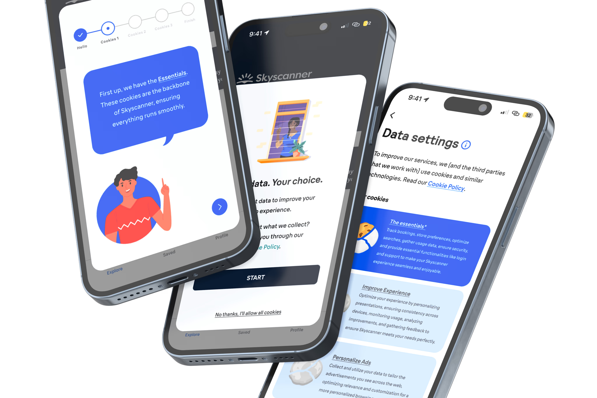
High-fidelity wireframe 💻
I developed high-fidelity wireframes based on insights from my mid-fidelity and icon usability testing, focusing on improving the user experience for the cookie policy onboarding process and settings page while staying true to brand guidelines identified in the visual research phase. The onboarding screen introduces Sky Scanner’s mascot, Clo, who uses a friendly tone to explain the cookie policies in a simple, engaging way, inspired by educational apps to make the process more approachable. On each cookie overview screen, I simplified the explanations to highlight only the key points, preventing information overload. Additionally, the settings page now features more user-friendly control buttons.

Usability testing - UX curve 🤔
I conducted additional usability testing with the high-fidelity wireframes, using the UX Curve method to have users note their experiences at each key stage of the revised cookie policy. While the overall tutorial popup received positive feedback, I found that the cookie summary page and settings page required adjustments to reduce user confusion.

High-fidelity wireframe - Design revision 💻
After designing the mid-fidelity wireframes, I gathered additional feedback from my colleagues. The following two changes were made based on their input.


DEFINE.
FINAL DESIGN 🥳
Here’s a prototype showcasing all the improvements from previous iterations. Give it a try!
Reflection 🙌
Here are some reflections on what I learned!
USABILITY TESTING
Throughout this project, usability testing proved invaluable in refining the user experience. Each round of testing provided actionable insights into user needs and highlighted areas where the design could be simplified or clarified. Testing with real users helped me identify subtle issues that might otherwise have been overlooked, ultimately leading to a more user-friendly and effective product.
RESEARCH
Research formed the foundation of this project, guiding each design decision from early concepts to final adjustments. Exploring educational apps, brand guidelines, and visual trends informed both the aesthetic and functional elements of the wireframes. This process reinforced how thorough research not only inspires better design choices but also ensures the final product aligns closely with user expectations and industry standards.
NEXT STEP.
How can I improve this further? ☀️
Here are some potential improvements I could make in the future.
🤹
ENHANCING TUTORIAL INTERACTIVITY
To keep users engaged throughout the onboarding process, I plan to make the tutorial more interactive, possibly adding animations. This will help capture attention and make the experience feel more dynamic, reducing the likelihood of users losing focus.
🎮
ADDING A QUIZ FOR UNDERSTANDING
A fun addition I’m considering is a short quiz on the final page of the tutorial. This would not only provide a lighthearted way to wrap up the onboarding but also serve as a check for user understanding, reinforcing key points covered in the tutorial.
Thanks for checking out my portfolio!
Copyright © 2025 Nayeong Cho. All rights reserved.